ModelTV
Overview
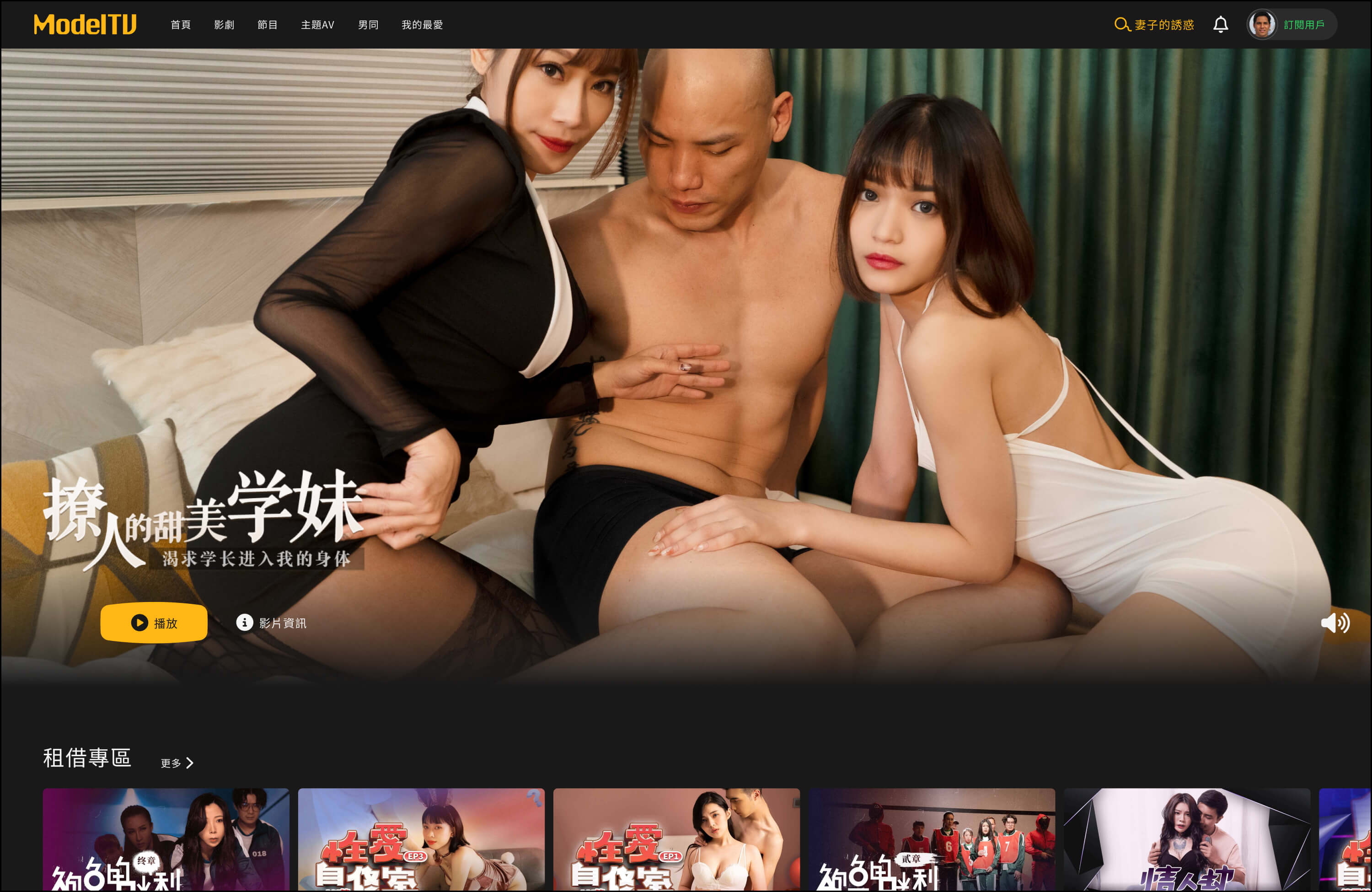
I redesigned ModelTV's streaming platform for Asian markets to fix three critical UX issues that were costing the company users and revenue. I was the sole designer working with 5 engineers and 1 PM, and the customer service team.
My Contributions
Identified UX issues from analytics and support tickets
Led the A/B test that removed the landing page
Designed flows for landing, account center, and video preview
Rebuilt the component library from scratch
Validated navigation patterns with Hotjar heatmaps
THE CHALLENGE
ModelTV launched fast during the pandemic, and the technical debt was visible. The platform worked, but three problems were hurting conversion at every step of the funnel:
60% of users dropped off after seeing the landing page.
40% of support tickets came from users who couldn't navigate the account center.
Video previews had near-zero engagement. Users opened them, glanced, and closed within seconds.
We hadn't built personas before launch, but two months of analytics gave us a clearer picture: users came with high intent, preferred a low digital footprint, and had low tolerance for friction. They didn't self-recover when blocked. They contacted support, or churned.
THE APPROACH
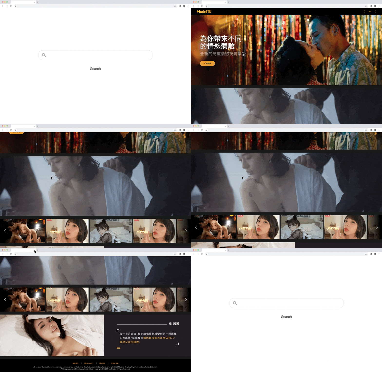
1. Cut the landing page entirely
I ran a competitive audit of major streaming platforms across China, Japan, and Taiwan. Most successful ones skipped traditional landing pages and dropped users straight into content discovery.
I proposed an A/B test: remove the landing page, send users directly to the browse page. The PM agreed to a 6-week test, 50/50 split. The redesigned landing page reduced bounce rate to 54%. Direct content access reduced it to 37%. Data drove the decision.
2. Switch to side navigation
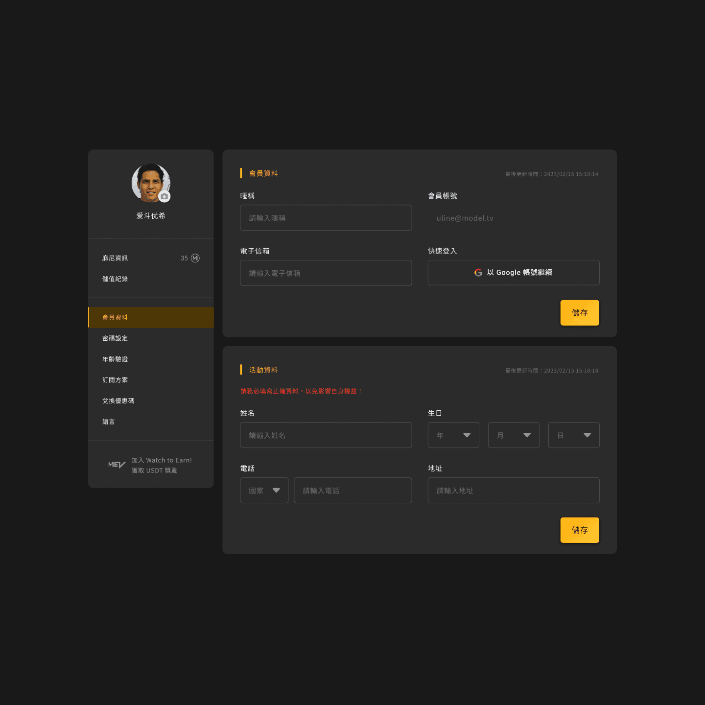
The account center was a single long scroll. I drafted two alternatives, top tabs and side navigation, then used Hotjar to compare behavior.
Top nav users clicked through 2 to 3 tabs before finding the target. Side nav users found the target on first click. With this many features (subscription, payments, promo, privacy, preferences), tab grouping created discoverability issues. Side nav exposed the full feature set upfront, which matched our users' goal-oriented behavior.
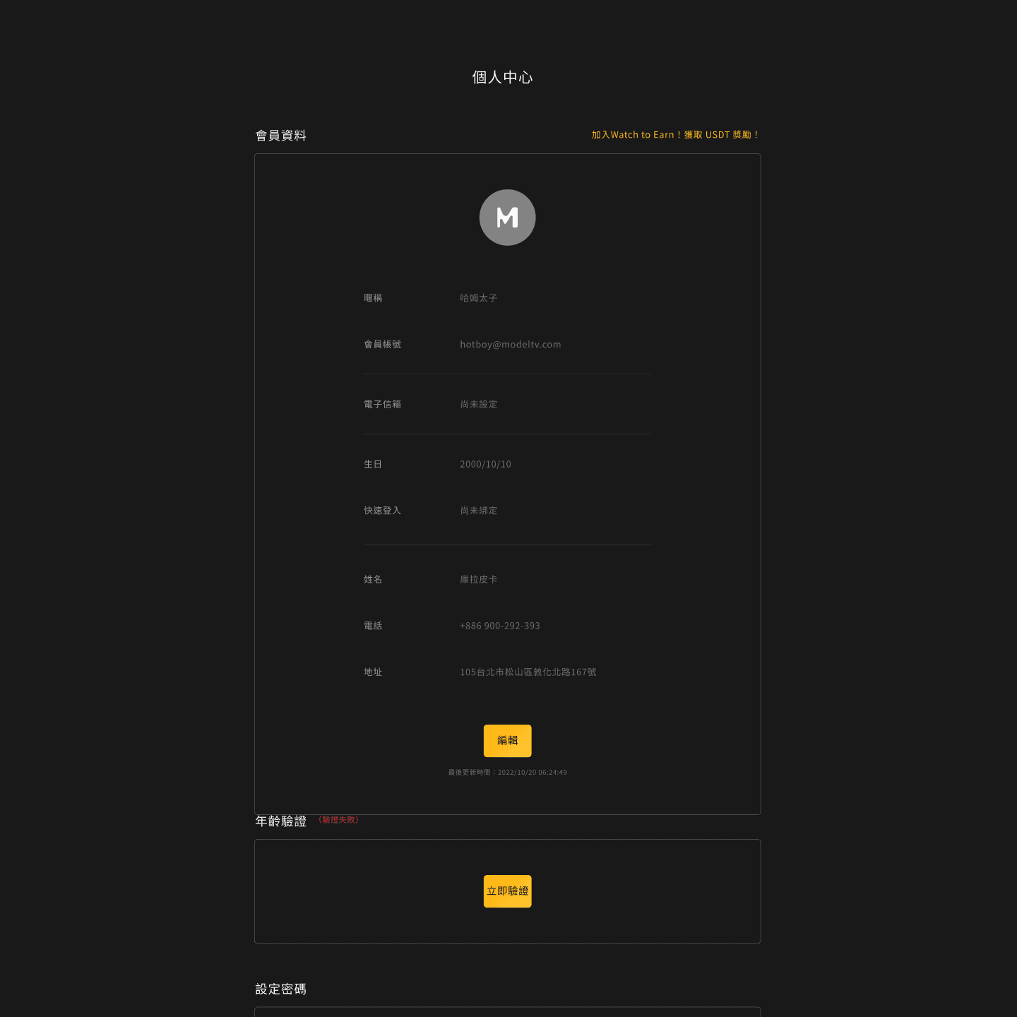
Before
After
3. Redesign the video preview with vertical scroll
The PM and I aligned on what to add: tags, performer info, related recommendations, and a save action. The harder question was layout. Surfacing all of it in a single modal increased cognitive load without adding clarity.
I designed a vertical scroll layout instead. Users could scan the essentials first, then scroll for tags, performer details, and recommendations at their own pace. Progressive disclosure over information density.
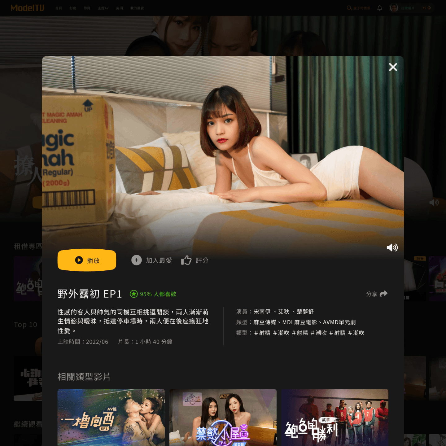
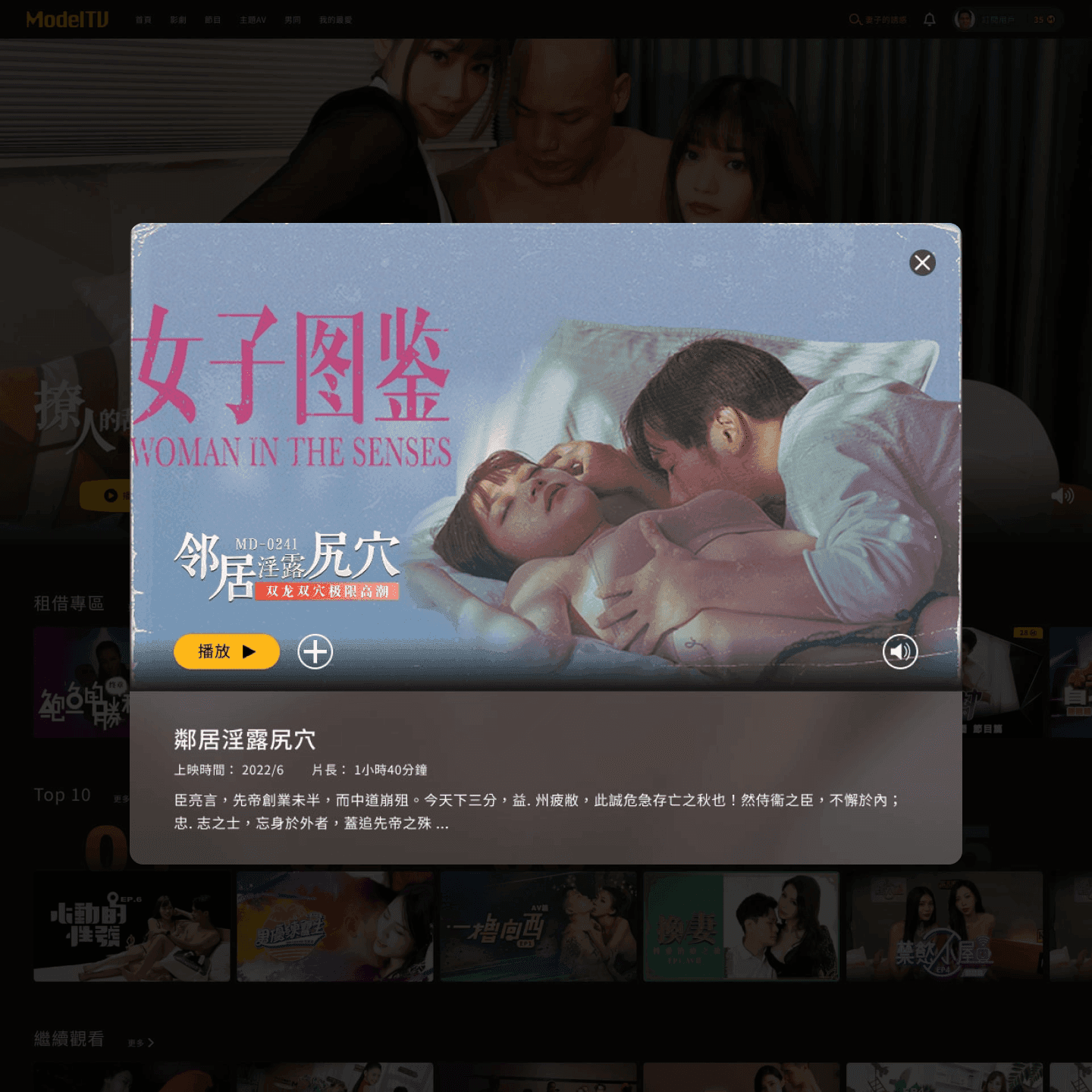
Before
After
THE OUTCOME
Revenue grew 23% over 6 months. The biggest single driver was the bounce rate reduction from 60% to 37%, which meant more users reached the content layer. Page views per session also increased.
Support tickets dropped 19%. Tickets about cancellation and promo codes dropped to near zero. A teammate from customer service told me, "Users hardly ask how to cancel subscriptions anymore." That stuck with me more than any chart.
Video preview engagement increased. Users scrolled through tags and performer info instead of bouncing on first view.
The component library reduced design-to-dev handoff time by around 30% based on engineering's estimate. Component-related questions in standups stopped.
REFLECTION
The thing I keep thinking about is that the biggest problem (the landing page) was the one nobody had been raising. The team had normalized the friction. The 60% who churned didn't file a ticket. They just left.
Proposing "delete the landing page" felt risky at the time, and I wasn't fully sure it would work. If I were doing this again, I'd push for A/B testing earlier instead of waiting for permission.
I also learned that my frontend background changed how I worked with engineers. I could discuss refactor cost in their language, which made them more willing to commit to design system work that has no visible user-facing payoff. That's a kind of cross-functional fluency I want to keep developing.