TYPE
Startup
PLATFORMS
Web, Mobile Web
PROJECT DURATION
6 months
MY ROLE
UI/UX Designer
A story of How data-driven UX increased revenue by 23% in six months
In July 2022, I joined ModelTV, a startup focused on adult content streaming targeting Asian markets. The pandemic had boosted online entertainment demand, and we saw a market opportunity to move fast. However, while we'd built a solid reputation in the market and gained considerable subscriptions, user experience challenges were severely impacting our revenue and performance metrics.
Objective
This project focused on redesigning our platform to address these critical usability issues. The goal was to create a more intuitive, privacy-conscious streaming experience that reduces user friction, improves content discovery, and ultimately drives sustainable revenue growth while reducing operational costs through better design systems.
My Role and Responsibilities
UI/UX Designer working closely with PM on platform improvements
Collaborated on problem identification and user behavior analysis
Designed and validated solutions through A/B testing
Facilitated cross-functional collaboration between design, PM, engineering, and customer service
Led design system rebuild and component standardization
Contributed to data analysis and metrics interpretation
Created prototypes and interaction designs
Our Challenges
A redesign is challenging for various reasons, especially in the adult content streaming space. We had to cater to multiple Asian markets' privacy expectations and cultural sensitivities while working within startup constraints. After rapid initial development, our platform had accumulated design inconsistencies that made scaling difficult, and we needed to find a balance between user privacy, business viability, and technical feasibility.
Thress Main-Challenges
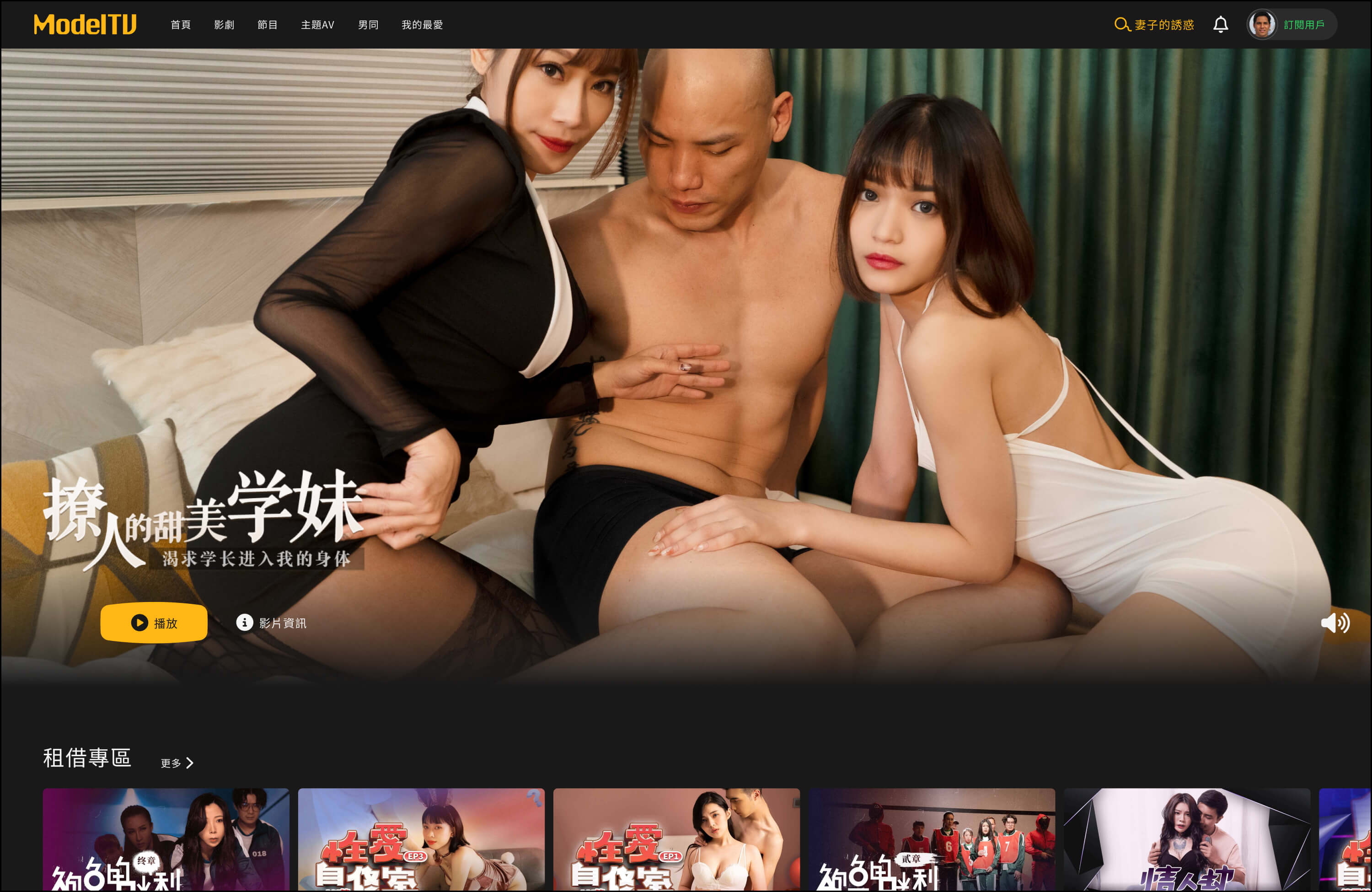
01. Landing Page: A 60% User Loss Problem
Through data analysis, we discovered that 60% of users left immediately after one glance at our landing page. This massive bounce rate was blocking potential users from even entering our platform to explore content. Users were arriving with clear intentions, but something about our landing page was causing them to abandon their journey before it began.
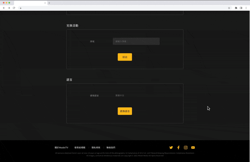
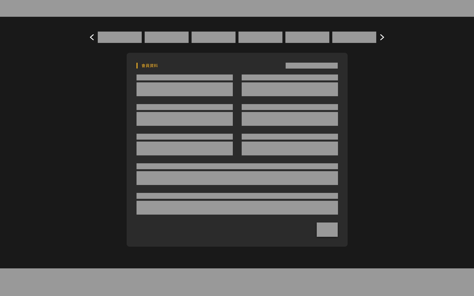
02. Account Center: Navigation Confusion Crisis
Our customer service team's weekly user issue reports revealed that 40% of support tickets came from navigation problems: "I can't find how to cancel my subscription," "Where do I enter my promo code?" and "This settings page is way too long - I can't find anything."
Looking at our account center design, I realized we'd used a traditional vertical layout where everything was stacked on one really long page. Users had to scroll endlessly to find what they needed, creating frustration and driving them to contact support instead of completing tasks independently.
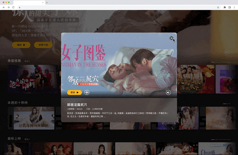
03. Video Preview: Low Engagement Challenge
We noticed that users would open the preview modal, take a quick look, and then close it without doing anything else. The preview modals weren't providing enough information for users to determine if the content matched their preferences, and there was no guidance on what to watch next. This lack of engagement was limiting content discovery and reducing time spent on the platform.
User Insights
Due to our rushed product launch, we hadn't developed user personas beforehand. However, after two months of platform operation, we had accumulated enough user data to understand who was actually using our product. Through analysis of our analytics data and customer service feedback, we identified distinct behavioral patterns that differed significantly from typical streaming platforms. Adult content platform users showed three key characteristics that directly impacted how they interacted with our interface.
Users consistently demonstrated three distinct patterns:
Cautious behavior around leaving digital footprints, preferring quick, direct access to content without extensive browsing trails.
Goal-oriented browsing with specific intentions, relying heavily on content categories and tags to navigate.
Low tolerance for confusing interfaces - when they couldn't find basic features like subscription management, they immediately contacted support rather than exploring alternative navigation paths.
These behavioral insights revealed why our three main challenges were so critical. The high bounce rate reflected users' need for immediate, friction-free access. The navigation confusion stemmed from their low tolerance for complex layouts. The poor preview engagement resulted from insufficient information to support their goal-oriented decision-making process. Understanding these patterns gave us clear direction: reduce friction at every touchpoint, provide transparent information upfront, and design for efficiency rather than exploration.
Design Strategy
Facing urgent pressure to solve these problems, the PM and I decided to embrace the startup mindset: make bold assumptions and test them quickly. We weren't trying to create the perfect design. We just needed to find solutions that could solve our biggest problems fast.
01. Landing Page: Solving the 60% User Loss
Competitor Research That Changed Everything
I spent a whole day going through major adult content platforms across China, Japan, and Taiwan. What I found honestly surprised me: most successful platforms didn't even bother with traditional landing pages. Users just went straight to browsing content when they arrived.
I remember thinking, "Wait, are we overthinking this whole landing page thing?"
Our Crazy Idea
I pitched what felt like a pretty crazy idea to the PM: "What if we just ditch the landing page completely and send users directly to the content browsing page?"
The team's reaction was... interesting. Everyone kind of stared at me for a moment. I mean, conventional wisdom says you need landing pages to showcase your brand and convert visitors, right? But our logic was simple: users coming to adult content platforms already know exactly what they want. Why make them jump through extra hoops?
Testing Our Hypothesis
We set up an A/B test with two versions:
Version A
Redesigned landing page

Version B
Version BDirect access to content page

For 6 weeks, we split traffic 50/50. Every week, the PM and I would sit down and go through the numbers together. I was honestly a bit nervous. What if I was completely wrong? But the results were pretty clear: direct content access dropped the bounce rate from 60% to 37%, while the redesigned landing page only got us to 54%.
The CEO Meeting I'll Never Forget
Convincing the CEO was... challenging. I prepared this whole competitive analysis report and tried to explain what I was calling "motivation loss" logic: users have peak motivation when they first arrive, and every extra step could kill that momentum.
I still remember that meeting. The CEO looked confused and asked, "Without a landing page, how will users understand our brand value?" The PM and I spent ages explaining, but honestly, it was the data that finally convinced him. Sometimes numbers speak louder than design theory.
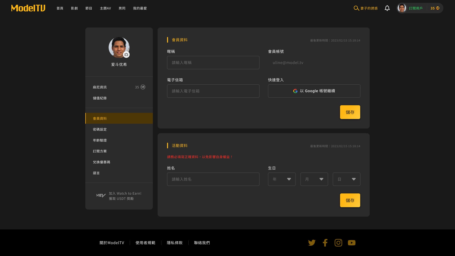
02. Account Center: Fixing the Navigation Confusion
Back to the Drawing Board
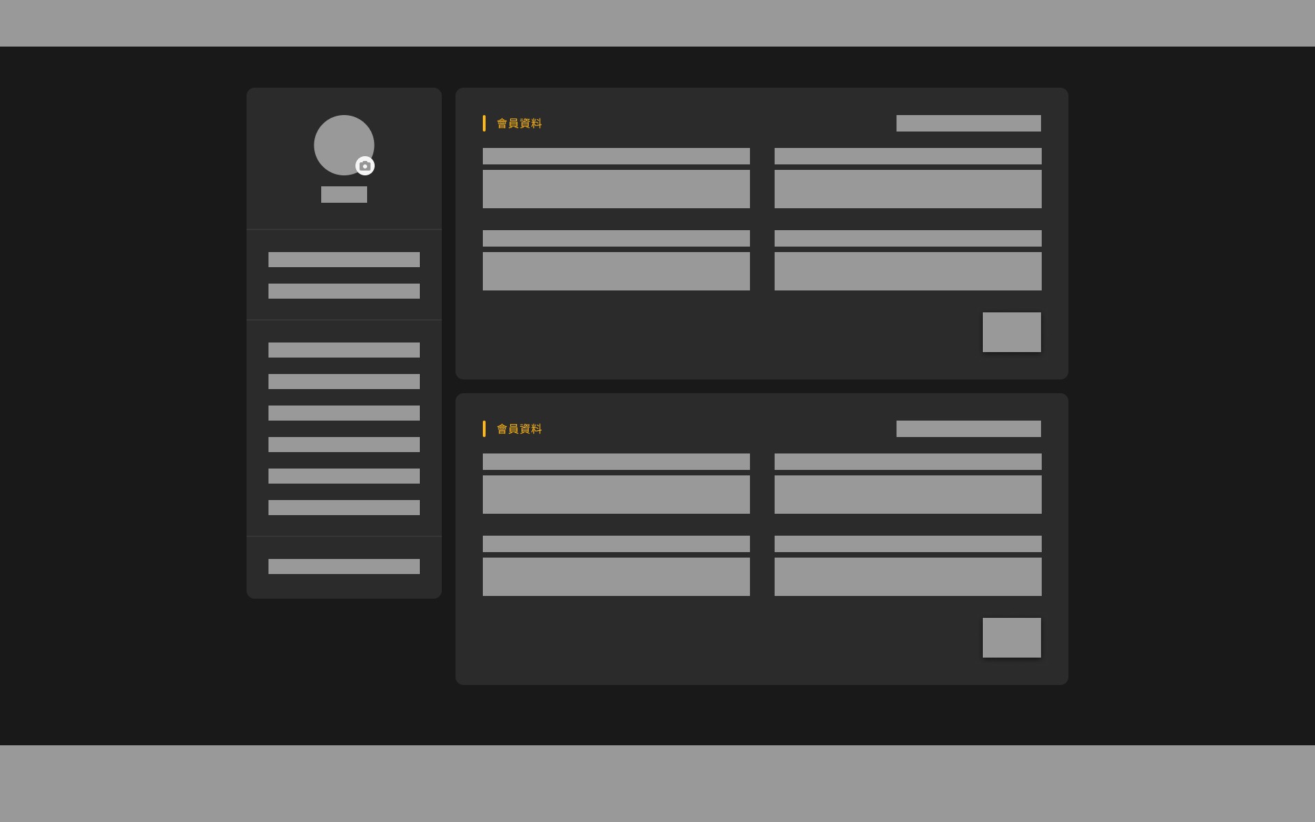
Looking at our account center disaster, I proposed two possible design approaches, and we decided to let user behavior decide:
Top Navigation
Horizontal tabs to organize features
Side Navigation
Vertical menu showing everything at once
What We Considered
The challenge was that we had quite a few features to organize: subscription management, payment history, promo codes, privacy settings, and account preferences. With top navigation, we'd need to group these into categories, which could hide some functions. With side navigation, everything would be visible at once, but it might feel overwhelming.
What Users Actually Did
We used Hotjar to see where people were actually clicking. The results were eye-opening:
Users consistently demonstrated three distinct patterns:
Top navigation meant users had to hunt through tabs when we had lots of features
Side navigation lets users spot what they need immediately
What really convinced me was watching the heatmap recordings. Users with top navigation would click on one tab, realize it wasn't what they wanted, then click another tab, and sometimes a third one. With side navigation, they'd scan the menu and click directly on their target.
It became obvious: users wanted "quick access to the feature I'm looking for," not a beautiful interface they had to figure out.
Final Design
03. Video Preview: Improving the Low Engagement
What We Were Trying to Fix to the Drawing Board
Our goal was straightforward. We wanted to make the video preview windows actually useful by giving users way more information about content, helping them decide if something was worth watching, and keeping them browsing instead of leaving after one preview.
The Features We Added
After lots of back-and-forth with the PM, we settled on:
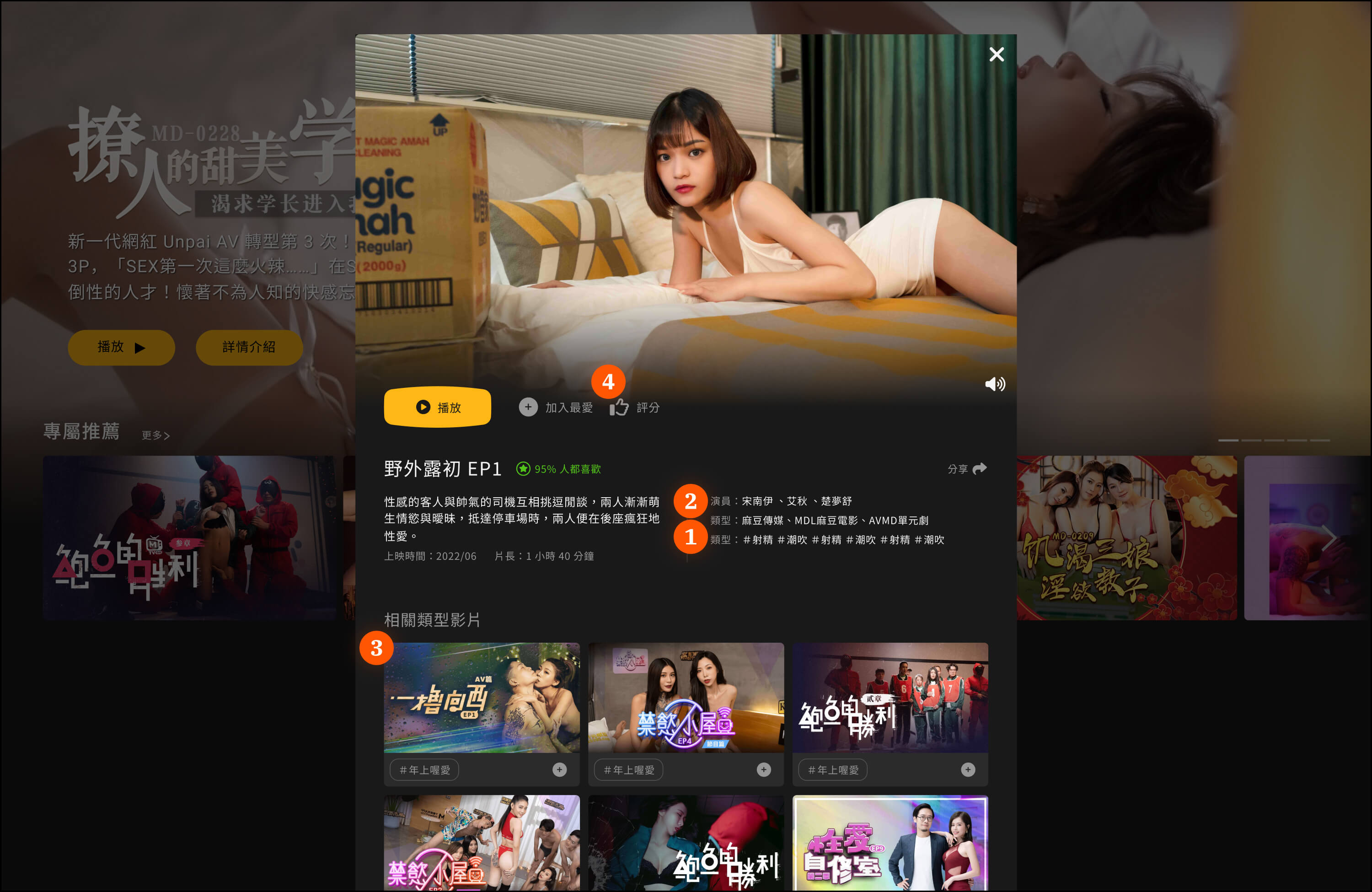
Video Tags: Clear labels so users knew what they were getting into
Performer Info: Details about specific performers (users definitely have preferences)
Related Recommendations: Suggestions based on what people actually watched, not what we thought they should watch
Social Features: Let users save stuff they liked for later
Redesigning for Better Information Flow
Because we were adding all these new features, we also needed to completely redesign the layout. I decided to go with a vertical scrolling approach that would provide users with a clear, step-by-step video information popup.
The design direction was focused on vertical flow, letting users gradually scroll down to understand the video's content, features, and related information. This approach allowed users to read and explore at their own pace, providing good visual guidance and a better viewing experience. Instead of overwhelming them with everything at once, they could digest information progressively as they scrolled.
This whole experience taught me that good design isn't about making things look impressive. It's about making things work so well that people don't even think about the interface.
Design System Rebuild
Why We Needed a Design System? After we wrapped up those three major fixes, I thought we were done with the big problems. But then I started noticing something that was honestly driving me crazy: our platform looked like it was designed by five different people who never talked to each other.
I decided to spend a week going through every single page and component to see what we were actually working with. What I found was pretty embarrassing:
8 different button styles doing the exact same thing
Colors that seemed picked at random
Spacing that made no sense whatsoever
I remember thinking, "How did we let this get so messy?"
The worst part was watching our daily standups. Engineers would constantly interrupt the flow to ask me, "Which button style should I use for this?" Then I'd have to open like 10 different pages just to figure out what we'd used before. It was wasting everyone's time, and I could see the frustration building.
I finally went to our PM and said, "Look, we need to stop everything and fix this design system mess. I know it seems invisible to users, but it's killing our development speed."
How I Made It Happen
Convincing the team to pause feature work for design system cleanup was not easy. Everyone was busy, and honestly, most people couldn't see why this mattered so much. But my frontend background really helped here. When engineers pushed back about refactoring code, I could actually explain why the changes would make their lives easier, not harder.
I started by showing them specific examples: "See how you had to write custom CSS for this button three different times? With a unified system, you'll just use one component." I put together detailed documentation with actual code examples they could copy-paste. The key was making it feel like I was reducing their workload, not adding to it.
The PM gave me a month to get this sorted out. We agreed that any new features had to use the new components, but we wouldn't force immediate changes to existing stuff. Gradual migration felt less scary for everyone.
What Changed
The difference was pretty dramatic once we got everything standardized. Our design-to-development time dropped by about 30% because engineers weren't constantly rebuilding the same components. Those daily "which button should I use?" questions basically disappeared.
But what really surprised me was how much better the platform started to feel for users. Everything looked more professional and predictable. People stopped getting confused navigating between different sections because the interface was finally consistent.
Looking back, this whole experience taught me that sometimes the biggest problems are the ones you can't see immediately. Building a design system wasn't just about making pretty components. It was about proving I could identify systemic issues and actually get a team to care enough to fix them, even when I was still pretty new to the company.
Business Impact
Throughout the 6-month improvement process, our PM team kept tracking key metrics daily while the customer service team reported changes in user feedback. This continuous monitoring helped us quickly spot problems and adjust our strategy.
The Numbers That Mattered
Bounce Rate: 60% → 37% (dropped by 23 percentage points) 📉
Honestly, this was way better than we'd hoped for. After removing the landing page, way more users actually made it into the platform to browse content. We also noticed users were viewing more pages on average, showing they were more willing to explore what we had to offer.
Account Center: Navigation Confusion Solved
Customer Service Tickets: 19% reduction 📉
This result was such a relief for our customer service team. The most obvious change was that we basically stopped getting tickets about people not being able to find the subscription cancellation feature. Questions about promo code redemption also dropped significantly.
Video Preview: Engagement Finally Improved
Average Time Spent: Significantly increased 📈
The vertical design approach really paid off. Users were now scrolling through the preview information at their own pace, exploring video tags, performer details, and related recommendations. On an adult content platform, users staying longer means they're actually interested in the content and more likely to watch something.
Overall Business Impact
“23% Revenue Growth 📈”
When we saw this number, the whole team was pretty excited. 23% revenue growth over 6 months came from more new users actually converting, existing users sticking around longer, and people spending more time watching content.
The Stories Behind the Data
These numbers represent real improvements in user experience. I remember a customer service colleague telling me: "Users hardly ask how to cancel subscriptions anymore" - that moment really hit me.
But beyond the customer service feedback, I also noticed users were actually using the new features we'd added. Video tags and performer info weren't just sitting there - people were clicking on them to find similar content. Even the social features saw more adoption than we expected.
Learning & Takeaway
Looking back on this whole ModelTV thing, I honestly didn't expect to learn this much. When I first joined, I was just trying to figure out how to go from coding to actual UX design. Ending up with a 23% revenue increase? That wasn't even on my radar.
What really got me wasn't the business numbers, though. It was finally understanding that good design isn't about making stuff look cool. It's about making things work so smoothly that people don't even notice the interface. Remember when I pitched removing the entire landing page? Everyone thought I was nuts, but the data proved users just wanted to get straight to browsing.
Turns out my frontend background was actually super helpful. I could explain to engineers why certain changes would make their lives easier, not harder. And spotting that design system disaster? Convincing everyone to fix eight different button styles felt like a real achievement.
But the moment that really hit me was when our customer service person said, "Users hardly ask how to cancel subscriptions anymore." That meant more to me than any revenue chart.
This whole experience taught me to back up my gut feelings with actual data, speak up even when I'm the new person, and sometimes make bold calls when they actually make sense. Most importantly, I learned that design can genuinely help a business while making people's days a little less frustrating.
That's probably what good UX is: fixing problems people didn't even know they had.
❞ Now that you've learned about my UX skills, check out a sample of my UI skills … here 👈