DriveSafety
Overview
A 14-week project in partnership with Changemakers, exploring how digital design could reduce speeding among young drivers in Canada.
My Contributions
Led end-to-end design for App and CarPlay, from concept to high-fidelity
Facilitated team coordination, weekly stakeholder meetings, and project delivery
THE CHALLENGE
We partnered with Changemakers on a real-world brief inspired by the Winnipeg Police Service’s Just Slow Down campaign, which has run since 2009.
Despite years of awareness ads and enforcement, young men 18 to 27 still account for the highest number of speeding offences in Canada. Traditional approaches were hitting a ceiling:
Fines and tickets didn't change long-term behaviour.
Speed cameras only worked while drivers were aware of them.
Awareness campaigns were ignored by the highest-risk group.
THE APPROACH
1. Run research to find the real problem
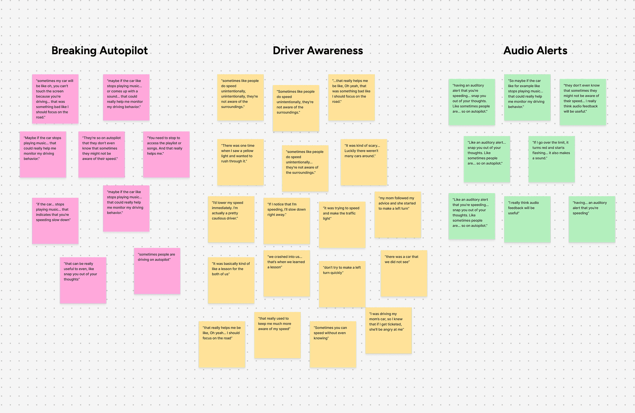
We conducted semi-structured interviews with drivers aged 16 to 30. I synthesized the findings into three key insights:
Speeding is often unconscious, with drivers describing going on "autopilot."
Drivers respond to internal self-awareness more than external punishment.
Disrupting attention through audio cues worked better than traditional warnings.
2. Reframe from punishment to reward
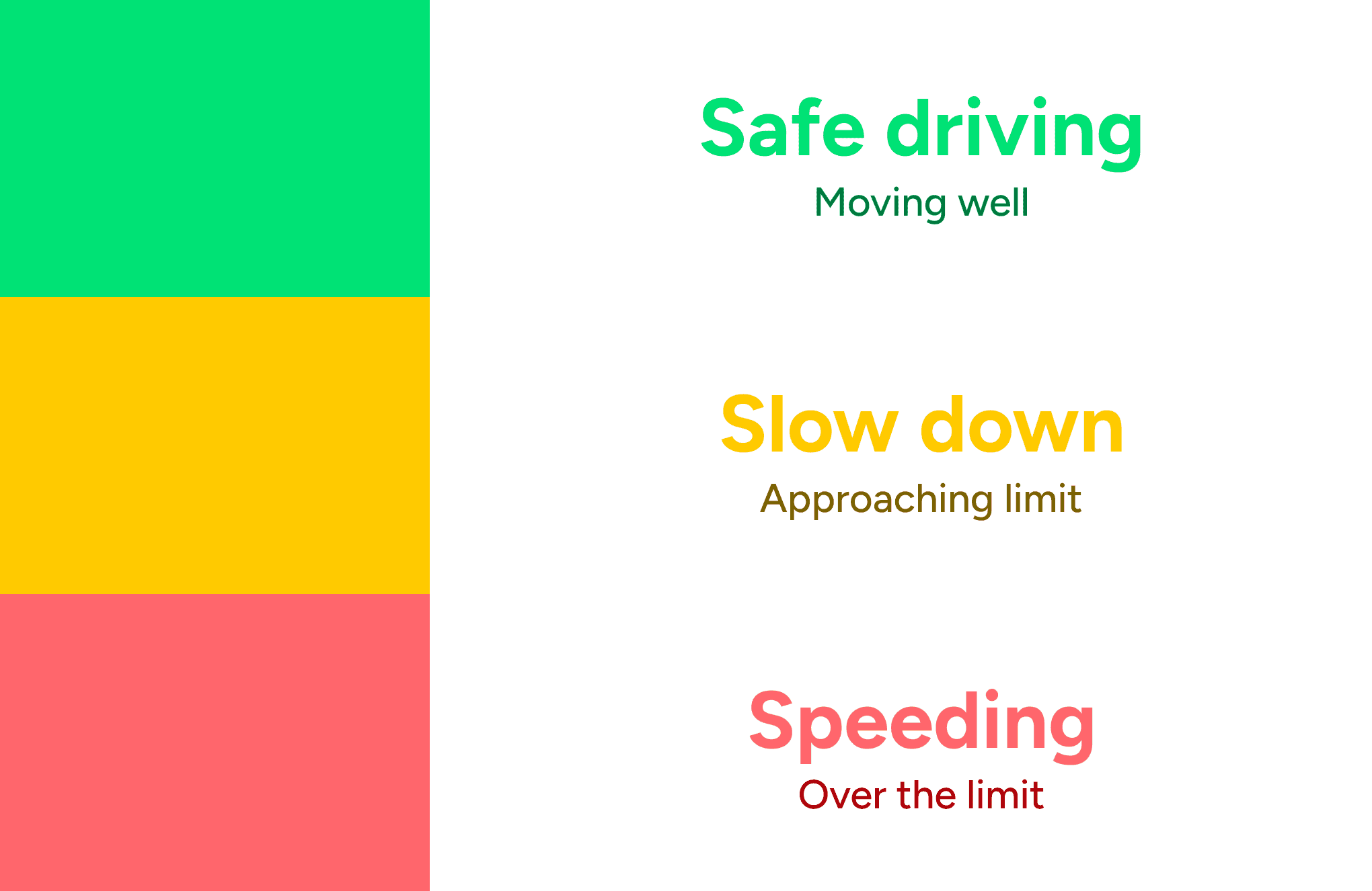
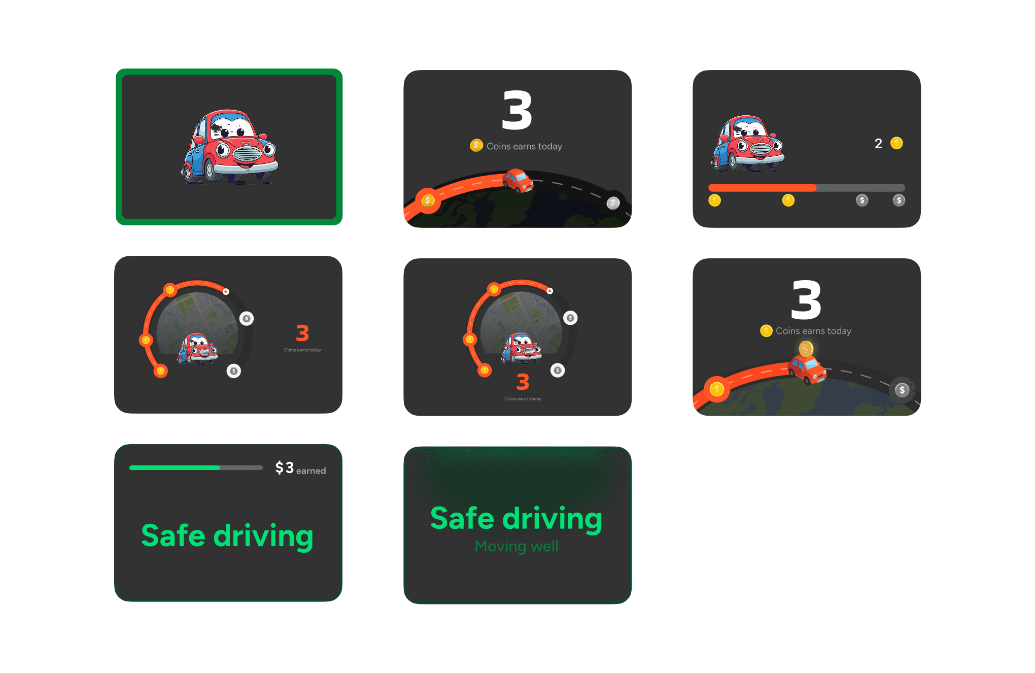
Most existing solutions try to scare drivers into slowing down. The research suggested the opposite might work better, so I proposed a traffic-light system built around gamification. Green means safe driving and earnings continue, yellow warns drivers approaching the limit and pauses earnings, and red signals speeding and deducts from their balance. The reward stays small but the feedback is constant, mirroring how speeding actually happens.
3. Split the experience between CarPlay and App
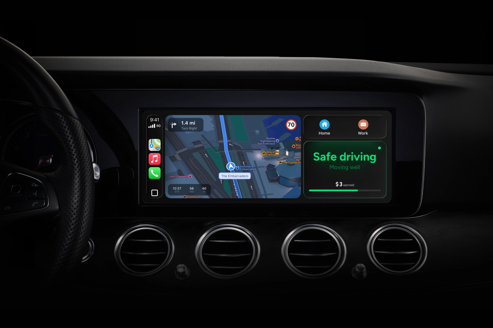
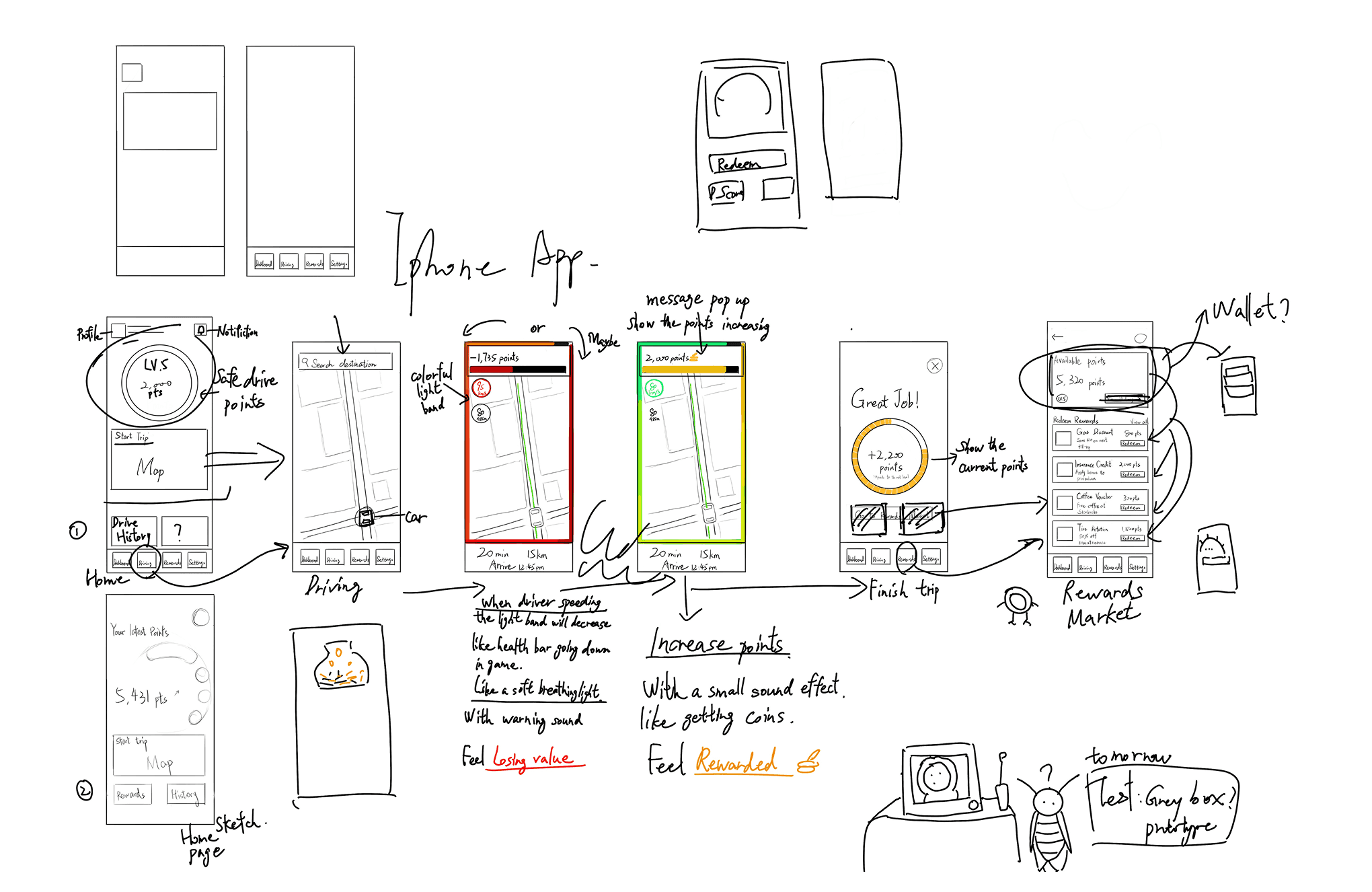
Drivers can't safely look at a phone, so CarPlay was the only legitimate in-car interface. I split the experience by context: CarPlay handles real-time feedback while driving, with green, yellow, and red status states. The App handles post-drive reflection: trip history, speeding insights, and gift card redemption. The CarPlay screen uses traffic-light colour coding for instant glanceability.
App
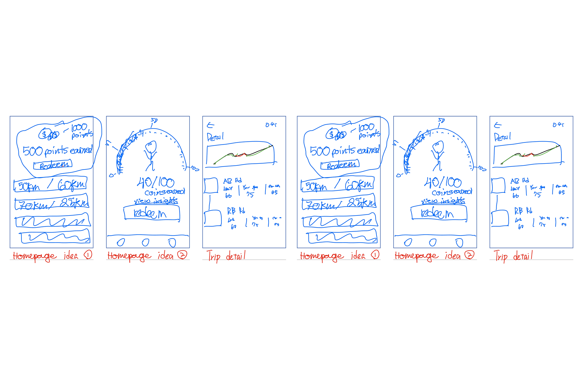
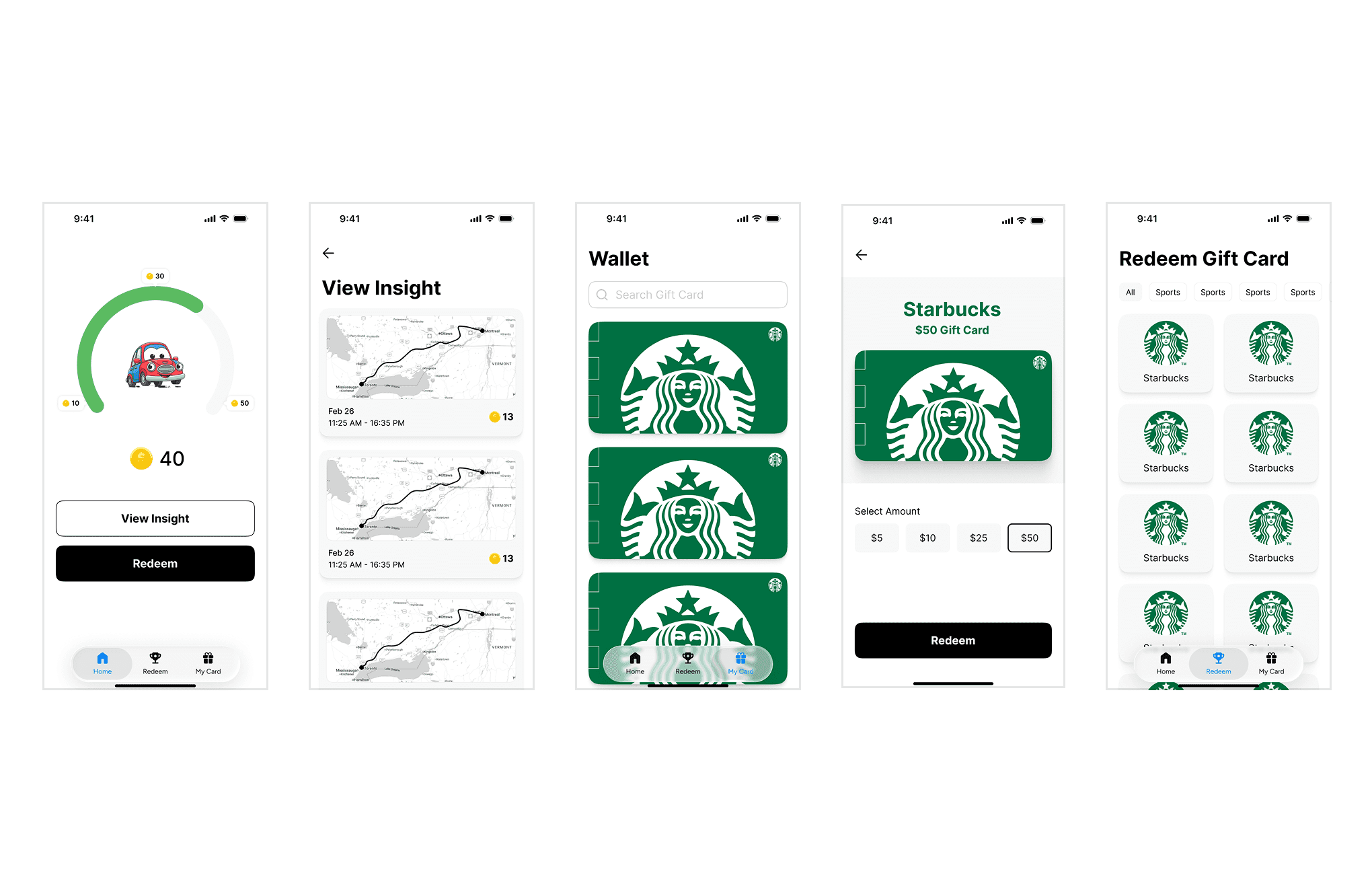
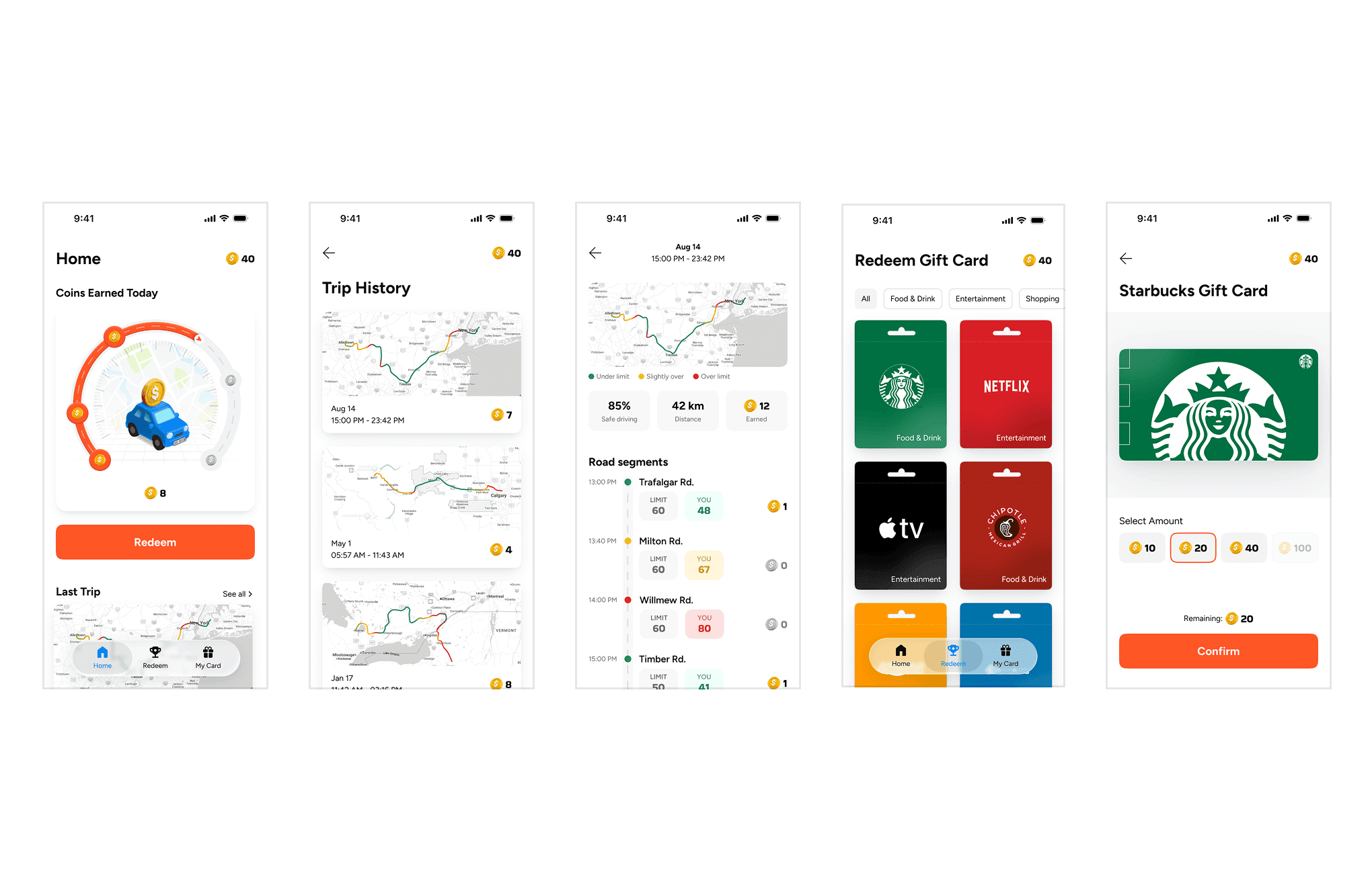
CarPlay
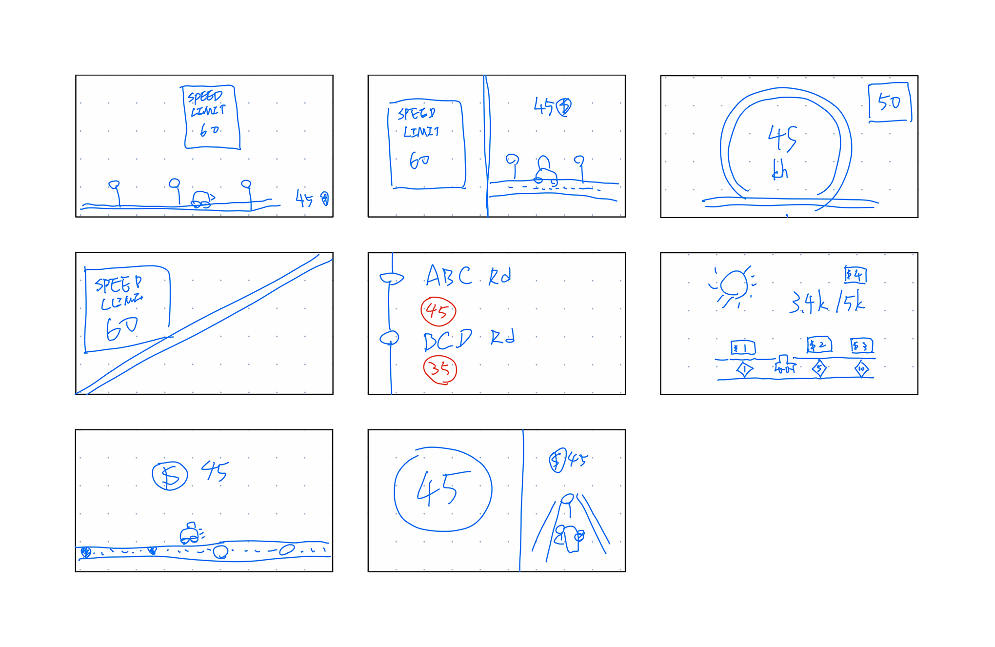
THE OUTCOME
We tested both surfaces with users via UserTesting. The App scored 97% task success and 4.6/5 ease across 15 users. The CarPlay test hit 4.7/5 readability with all 3 users understanding the colour system without instruction. I iterated on findings, including clearer coin breakdowns on the Insights page and more active language on the CarPlay earnings display.
We presented the final concept to Changemakers and the project sponsors. Both responded positively, with particular enthusiasm for the CarPlay experience. Every usability test participant said they would use it in real life, and several specifically recommended it for long-haul commuters. One participant put it best: "I think this app would reward good driving and massively encourage many people to be better."
REFLECTION
I learned that research can change what problem you're actually solving. We started thinking the brief was about designing a warning system. After 10 interviews and 123 coded quotes, we realised warnings weren't the answer. Drivers don't want to be punished, they want to feel in control. The reframe from punishment to reward only became obvious after we listened to them.
The second lesson was about platform choice. It's tempting to default to mobile because it's the most familiar surface, but the right place for in-the-moment driving feedback is the car, not the phone. Platform is part of the problem definition, not just the solution."
